Let me tell you, folks, dealing with color inconsistencies is like trying to wrangle a bunch of stubborn toddlers – it can drive you up the wall! But after years of running my painting business, I’ve picked up a few tricks that’ll help you with, conquering color inconsistencies and save you some serious headaches.
The Color Consistency Conundrum
First things first, let’s talk about what messes with color consistency. Light’s a big one – I can’t tell you how many times I’ve had a client freak out because their “perfect shade” looks different in the morning versus the afternoon. Then there’s the whole surface texture thing. Slap the same paint on smooth drywall and rough brick, and bam! Suddenly it’s like you’re looking at two different colors.
Oh, and don’t even get me started on paint quality. Cheap paint is like playing Russian roulette with your walls. Sure, it might look okay at first, but give it a few months, and you’ll be scratching your head wondering why your “eggshell white” is suddenly more like “dingy beige.”
Mixing It Up (The Right Way)

Now, here’s where the rubber meets the road: proper paint mixing. I learned this lesson the hard way, trust me. Back when I was starting out, I thought I could eyeball it. Big mistake. Huge. I ended up with a living room that looked like a patchwork quilt of slightly different shades. Not my proudest moment.
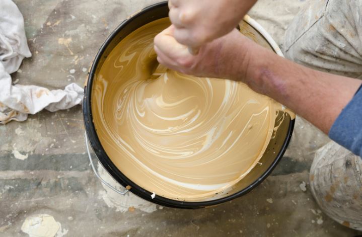
These days, I swear by using a mechanical shaker. It’s like having a tiny paint wizard in your corner. And for the love of all that is holy, don’t skip the stirring step! Even if you’ve just had it shaken, give it a good stir before you start painting. It’s like insurance for your color consistency.
Touch-Ups: The Bane of My Existence (But I've Got Solutions)


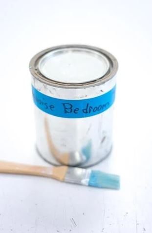
Alright, let’s talk touch-ups. They’re the bane of my existence, but I’ve picked up some tricks over the years. First off, always, and I mean always, keep some of the original paint. Label it like your life depends on it – room, date, sheen, the works. Future you will thank past you, trust me.
When you’re doing touch-ups, feather those edges like you’re stroking a baby bird. Blend, blend, blend. And here’s a pro tip: use the same applicator you used for the original paint job. Roller marks and brush strokes can make even a perfect color match look off.
The Great Fade Away
Now, let’s chat about the elephant in the room: fading and discoloration. It’s gonna happen, folks. Sun, humidity, that weird stain from when your kid decided to recreate Jackson Pollock on your walls – they all take their toll.
Here’s Leggettandsonspainting’s secret weapon: high-quality, fade-resistant paint. Yeah, it’s pricier upfront, but it’ll save you a world of hurt down the line. And for those high-traffic areas or rooms that get a lot of sun? Consider going a shade darker than you think you want. It’ll fade to the perfect color over time.
Consider using a fade resistant paint like Sherwin Williams Emerald for interiors and Sherwin Williams Duration for exteriors.
The Bottom Line
Conquering color inconsistencies is all about preparation, precision, and a little bit of painter’s intuition. It’s not just about slapping paint on a wall; it’s about creating a space that looks good and stays looking good.
Remember, folks, a little extra effort in the beginning can save you from a world of color-related headaches down the road. Trust me, I’ve been there, done that, and got the paint-stained t-shirt to prove it.
So, next time you’re gearing up for a paint job, remember these tips. Your walls (and your sanity) will thank you.
Remember,
if you’re in the Northeast Ohio area and want to hire a professional, call Leggettandsonpainting for a free estimate. “We Paint So You Don’t Have To.”